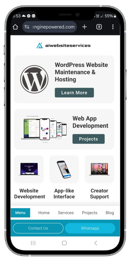
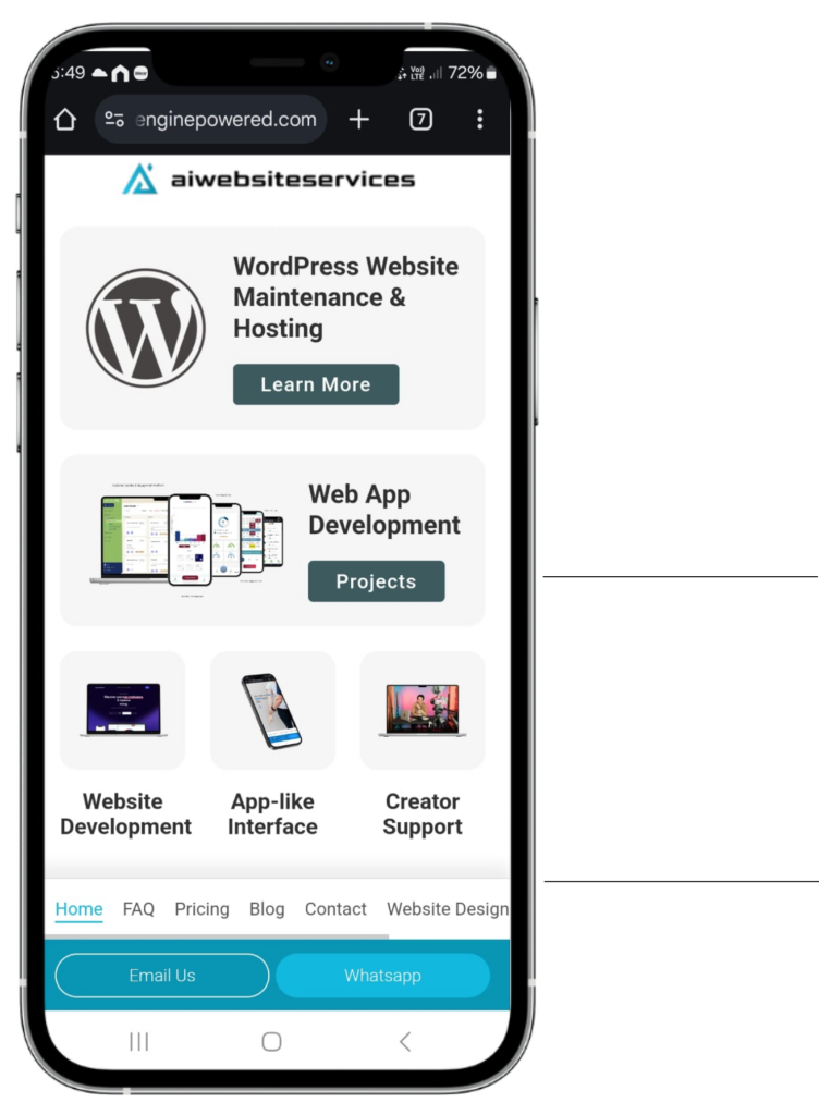
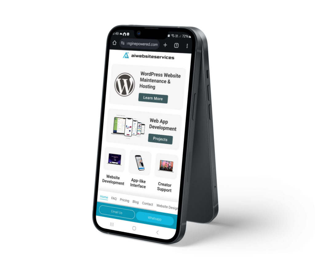
Transform your website into an App-Like Experience on Mobile
With mobile devices accounting for over 60% of global online traffic, stand out from your competitors by offering sleek, app-like navigation. Elevate your mobile user experience, boost engagement, and keep your audience coming back for more.
*Get this feature for FREE when you sign up for our hosting and maintenance package for 12 months.
UX-Centric Design
As of September 2024, mobile devices account for 63.38% of global website traffic, while desktops and tablets together make up the remaining 36.62%.
User experience (UX) plays a critical role in determining the success or failure of an application or website. Recognizing this fundamental principle, we have dedicated ourselves to crafting a website that revolves entirely around providing the best possible user experience.
Our approach to design prioritizes user-centricity, ensuring that every aspect of the website is intuitive, efficient, and delightful to interact with.
By carefully understanding the needs and preferences of our users, we have tailored the interface to be user-friendly, making navigation seamless and content easily accessible.
App-like Accessibility
App-like Accessibility
A mobile website with an app-like interface can make the user experience feel more familiar and intuitive. This familiarity can lead to higher user engagement and a reduced learning curve.
Familiarity: Many users are already accustomed to using mobile apps, so creating a mobile website with an app-like interface can make the user experience feel more familiar and intuitive. This familiarity can lead to higher user engagement and a reduced learning curve.
Improved User Experience: An app-like feel often means smoother navigation, faster load times, and interactive elements, all of which contribute to an improved user experience.
One-Hand Navigation for Effortless Use: Designed for ease and convenience, our one-hand navigation feature makes it simple to browse your website with just one thumb. Whether on the go or multitasking, users can easily navigate through your site without having to stretch or fumble. Enhance the mobile experience and ensure your visitors can access what they need with minimal effort, anytime, anywhere.
Reduced Development and Maintenance Costs: Building a separate native app for each platform (iOS, Android) can be costly and time-consuming. By creating a mobile website with an app-like feel using responsive design or PWAs, you can reduce development and maintenance costs, as you have a single codebase for all platforms.
Cross-Platform Compatibility: A well-designed mobile website with an app-like feel can work across various mobile devices and operating systems. This cross-platform compatibility means you can reach a broader audience without worrying about device-specific issues.
Discoverability: While native apps require users to download and install them, a mobile website is instantly accessible through a browser. This ease of access can lead to higher discoverability, as users can find your website through search engines or direct links without any additional steps.
Analytics and Tracking: With a mobile website, it’s easier to track user behavior and gather valuable analytics. This data can help you understand user preferences, optimize the user experience, and make data-driven decisions to improve your website’s performance.
Nav Bar Positioning
Nav Bar Positioning
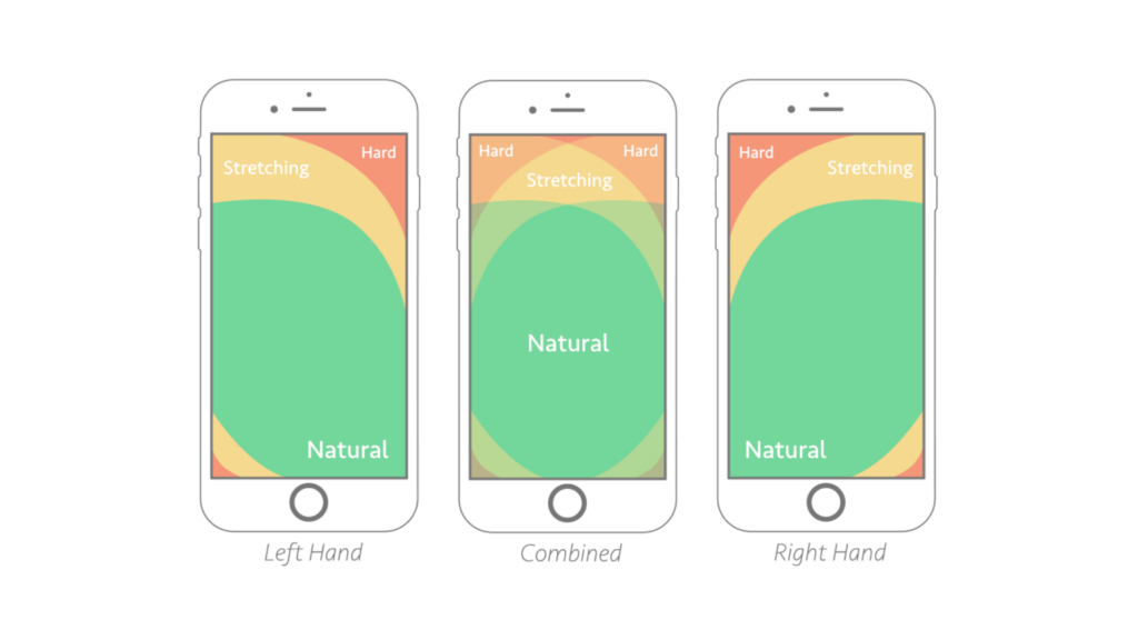
This design approach takes into account the natural behavior of mobile users who typically hold their devices with one hand while using their thumb to interact with the screen.
Improved User Ergonomics: Placing the menu within thumb’s reach ensures that users can navigate the website or app with ease and without straining their fingers or hands. This ergonomic design enhances user comfort and reduces the risk of repetitive strain injuries, making the overall experience more enjoyable.
Efficient One-Handed Navigation: By having the menu accessible within the thumb’s natural range of motion, users can perform actions with a single hand. This is especially useful in situations where users have limited mobility in one hand or are holding something else simultaneously.
Faster Navigation: With the menu positioned within easy reach, users can quickly access different sections or features of the website or app without having to shift their grip or use their other hand. Faster navigation enhances the overall efficiency of the user experience.
The Thumb Zone
The area on a mobile device screen that is easily reachable by your thumb when holding the device with one hand. It’s an important concept in mobile design because it helps guide how to place key buttons, menus, or interactive elements to make them accessible and user-friendly.
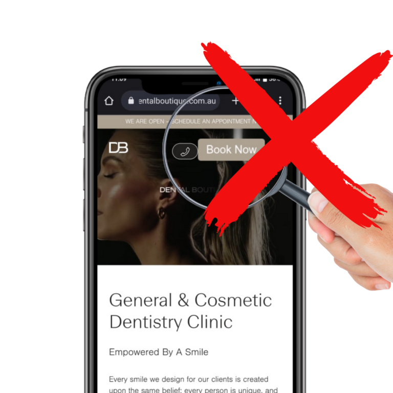
Nav Bars are typically positioned in the upper right corner of the screen, a location that often requires users to stretch their hands to access it. This can lead to a less comfortable and less user-friendly experience.
Benefits of an app-like mobile interface
Reduced User Frustration
When menus or essential functions are placed in hard-to-reach areas, users may become frustrated by the constant need to stretch or adjust their grip. Placing the menu within thumb’s reach helps eliminate this frustration, leading to a more positive perception of the website or app.
Enhanced Accessibility
Easy-to-reach menus improve accessibility for users with limited mobility or dexterity in their hands. It ensures that a broader range of users can comfortably interact with the content and functionalities of the mobile interface.
Consistent User Experience
With a menu placed within thumb’s reach, the navigation remains consistent throughout the website or app. Users won’t have to adapt to different navigation patterns or hand positions, resulting in a more seamless and intuitive user experience.
Lower Abandonment Rates
A well-designed, easily accessible menu can reduce the chances of users abandoning the website or app due to frustration with navigation. Users are more likely to stay engaged and explore the content when the menu is within their thumb’s reach.
Simplified Interaction
Placing the menu near the thumb allows for simpler gestures, such as swiping or tapping, to navigate the interface. Users can effortlessly interact with the menu items, reducing the need for complex gestures or multi-finger interactions.
Support for Larger Devices
As mobile devices continue to grow in size, reaching all areas of the screen becomes more challenging for users. Positioning the menu within thumb’s reach ensures that users can comfortably navigate, regardless of the device’s size.
We have recently changed IT providers to AI website Services and have been thrilled at the expertise, quality and timeliness of the work to date. Allaine is extremely helpful, will answer queries quickly and find solutions even faster. We are excited to see the development of a new web application they are building for us and we have been updated, consulted and kept informed at every step of the process. We couldn’t recommend this team highly enough!
★★★★★Rated 5 out of 5
Jade Scott
Owner and director western region health osteopathy & Growthrx
I’ve been working with Allaine and his amazing team for two years now. Not only is he my Client Experiences Manager and Head of Technology, but he is also my greatest supporter.
His customer service and attention to detail is second to none – a great leader and wonderful at what he does. The overall results of the team are fabulous.
Allaine will work with you to determine a plan, customise the process, and help bring your vision to life. Anything from web apps and team customer service to graphic design or event management.
Allain and his team can do anything
★★★★★Rated 5 out of 5
SERVE HG
SERVE Hospitality Group
AI Website Services did a fantastic job redesigning and developing our website at SERVE Hospitality Group. The new look is fresh and a significant improvement from before. Their response time is quick, and the support is outstanding—always easy to reach, even for urgent needs. I highly recommend them to anyone looking to revamp their website and receive top-notch support. – SERVE Hospitality Group
★★★★★Rated 5 out of 5
Andy Croghan
CEO & Co-Founder
Wizardclicks Pty Ltd
We’ve known Allaine and the team a while now. And I’ve found them keen, affordable, knowledgeable, professional, and (importantly) available to manage projects including our own website, and that of clients. Business partners have also commented on their swift turnaround, competitiveness, and fair monthly hosting packages. We will definitely have further projects for aiwebsiteservices. Keep up the good work.
★★★★★Rated 5 out of 5
Carolina Lopez
Essence Medical Solutions
We were in need of an appropriate web developer for our network of providers. While working with Allaine we have been able to execute the vision of our brand through a collaborative effort. From our first point of contact to the first virtual meeting Allaine has been consistent with communication, punctual, detail oriented and extremely helpful throughout our development process. He has worked around our schedules and has also helped us with graphic design tasks that we needed to cover within our business.
As we continue to work together in developing our website we feel confident that Allaine will continue to guide us in the right direction and help us create an efficient website for our clients to use. Overall we have had a great experience working with Allaine and feel highly satisfied with the effort that is put into this project.
★★★★★Rated 5 out of 5
Mel Trumble
Life Coach | Author
Hello I am Mel Trumble, the founder of ZFG living LLC and I am here to tell you, you are lucky. Al is slammin, Al is the best he handles all of my requests, it looks so flipping good, I am in love with the way he puts things up. I think I’ve done a good idea and then it just looks so much better, so much more professional and inviting. He really get the vibe of my company and understands who I am and that just completely just flows through onto the website. I’m dealing with him for the PR and putting up the blogs and emails. He makes everything so easy, so five starts out of five I highly recommend Al.:
★★★★★Rated 5 out of 5
Dishan Kath
MATES RATES TV's
Just a quick wanted to thank and acknowledge the great service i have received from you guys at AI Website services. The debugging of my old website and the go getter attitude was really refreshing to see along with the prompt response times. Yall managed to debug an issue a competitor could not get on top of for months and I am also not getting bot/spam type queries. The service is much appreciated and the pricing is the best I have seen in your space, talk about bang for your buck. Look forward to continuing on doing business with you.
★★★★★Rated 5 out of 5
Jeremy Hobbs
Co-Owner The Second Visit
We have recently changed IT providers to AI website Services and have been thrilled at the expertise, quality and timeliness of the work to date. Allaine is extremely helpful, will answer queries quickly and find solutions even faster. We are excited to see the development of a new web application they are building for us and we have been updated, consulted and kept informed at every step of the process. We couldn’t recommend this team highly enough!
★★★★★Rated 5 out of 5
Jade Scott
Owner and director western region health osteopathy & Growthrx
I’ve been working with Allaine and his amazing team for two years now. Not only is he my Client Experiences Manager and Head of Technology, but he is also my greatest supporter.
His customer service and attention to detail is second to none – a great leader and wonderful at what he does. The overall results of the team are fabulous.
Allaine will work with you to determine a plan, customise the process, and help bring your vision to life. Anything from web apps and team customer service to graphic design or event management.
Allain and his team can do anything
★★★★★Rated 5 out of 5
SERVE HG
SERVE Hospitality Group
AI Website Services did a fantastic job redesigning and developing our website at SERVE Hospitality Group. The new look is fresh and a significant improvement from before. Their response time is quick, and the support is outstanding—always easy to reach, even for urgent needs. I highly recommend them to anyone looking to revamp their website and receive top-notch support. – SERVE Hospitality Group
★★★★★Rated 5 out of 5
Andy Croghan
CEO & Co-Founder
Wizardclicks Pty Ltd
We’ve known Allaine and the team a while now. And I’ve found them keen, affordable, knowledgeable, professional, and (importantly) available to manage projects including our own website, and that of clients. Business partners have also commented on their swift turnaround, competitiveness, and fair monthly hosting packages. We will definitely have further projects for aiwebsiteservices. Keep up the good work.
★★★★★Rated 5 out of 5
Carolina Lopez
Essence Medical Solutions
We were in need of an appropriate web developer for our network of providers. While working with Allaine we have been able to execute the vision of our brand through a collaborative effort. From our first point of contact to the first virtual meeting Allaine has been consistent with communication, punctual, detail oriented and extremely helpful throughout our development process. He has worked around our schedules and has also helped us with graphic design tasks that we needed to cover within our business.
As we continue to work together in developing our website we feel confident that Allaine will continue to guide us in the right direction and help us create an efficient website for our clients to use. Overall we have had a great experience working with Allaine and feel highly satisfied with the effort that is put into this project.
★★★★★Rated 5 out of 5
Mel Trumble
Life Coach | Author
Hello I am Mel Trumble, the founder of ZFG living LLC and I am here to tell you, you are lucky. Al is slammin, Al is the best he handles all of my requests, it looks so flipping good, I am in love with the way he puts things up. I think I’ve done a good idea and then it just looks so much better, so much more professional and inviting. He really get the vibe of my company and understands who I am and that just completely just flows through onto the website. I’m dealing with him for the PR and putting up the blogs and emails. He makes everything so easy, so five starts out of five I highly recommend Al.:
★★★★★Rated 5 out of 5
Dishan Kath
MATES RATES TV's
Just a quick wanted to thank and acknowledge the great service i have received from you guys at AI Website services. The debugging of my old website and the go getter attitude was really refreshing to see along with the prompt response times. Yall managed to debug an issue a competitor could not get on top of for months and I am also not getting bot/spam type queries. The service is much appreciated and the pricing is the best I have seen in your space, talk about bang for your buck. Look forward to continuing on doing business with you.


